Code
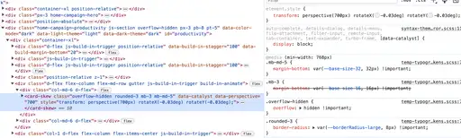
Looking into Github's code on their main webpage, it becomes fairly messy fairly quickly. I looked at how each section stands out and changes color based on mouse movement, and CSS is used to rotate the card slightly to make it appear that the card is angled towards the mouse, and that the background color shifts slightly around the mouse. However, I started to notice the abundant use of '!important' placed in the code, which was very prevalent throughout the CSS, causing an a simple stack at the bottom of the stylesheet of !important attributes whenever something needs to be updated / overridden.
UI
The design of the website is pretty good and interesting, as it uses a lot of card stacking to add extra depth to the site. In addition, sections pop up the further down you go on the page. Lastly, the color scheme slowly switches throughout the page, and looks really well as you see the slow transition of it via the color of headings.
UX
The interactivity of the site is amazing, and the emotional feel of where you are is emphasized a lot, which I really like. Content appears of out nothing when scrolling down and disappears when scrolling away from it, cards angle themselves slightly based on your mouse position when hovering over it, and a tint of color is added to the background of the card in a certain radius when hovering over the card. I also like how the line on the left hand side draws me down the page more, as it slowly fills in the blank space and continues downwards.

Summary
Overall, the Github is a pretty nice site to use when needed, and the UI and UX look and feel great while using the site. However, the code is quite messy, and filled with properties containing !important, making it simply a matter of putting new code at the bottom of the sheet to update the site properly.