Code
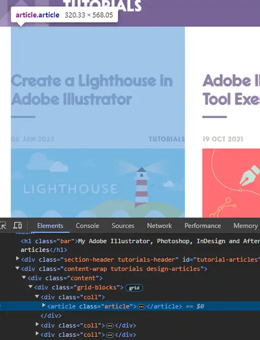
I wanted to take a look at the a page of articles relating to tutorials on Veerle's webpage, and it turns out to use an organized grid system. Each individual article is given the 'article' element, where they are then organized in rows of three, with a header, a figure, and a paragraph. The 'figure' then uses a hover state to grayscale the article image when hovered over.
UI
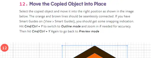
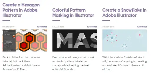
Poking around some pages I found the design of the website to be very neat. Everything is organized relatively well, the colors contrast great and have their unique palette which ties up the whole website. When looking at a design tutorial, she also likes to place emphasis on important aspects such as using certain tools and measurements of certain objects. There are also a lot of images that work well with the content, and their sizing is mostly consistent with it taking up the whole width of the view window. In addition, each photo is labeled with what step she's on, so it's really easy to follow alongside the tutorials.
UX
When navigating the website and certain articles, there are obvious features and visuals that indicate where your focus is on the page. Hovering over an article image turns the image monochrome, hovering over buttons turns the button into the section's color, and shoots an arrow from the left side to indicate that you'll be moving onto the next page. Overall the UX is very satisfying and very responsive to the user.
Summary
Overall, Veerle has a pretty great web design, where it looks clean, organized, and not too cluttered, while also providing nice responsiveness to the user when hovering over certain elements on the page. It was also interesting to see how they used a grid system to neatly place all of the articles onto one page, rather than using a flex-based system.